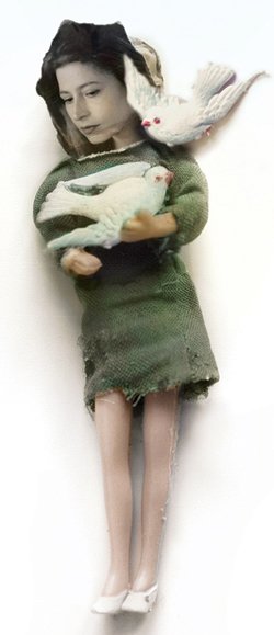
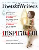
When we came across Polly Becker’s stunning assemblages on her website, www.pollybecker.com, we knew immediately that she was the perfect choice to illustrate our fourth annual Inspiration Issue. The Boston-based artist, who in her formative years was influenced stylistically by Art Nouveau and the Brandywine School, as well as, in particular, such artists as Edward Gorey, Alphonse Mucha, and Aubrey Beardsley, spoke about her work for us just one day after finalizing the image on our cover.

How would you describe your work?
I came to my manner of working the long way around, after many years of drawing and painting. I was in the habit of making what are called maquettes—desktop sculptures of miscellaneous materials I would light and photograph—as reference for my drawings. It was wonderful to realize that if I took a little more trouble with them, these could become final products. My drawings involved a lot of rendering, and were as realistic as I could make them, so when I left drawing behind it was thrilling to be so direct and to be able to work more intuitively and more quickly. Abstraction became possible when I was working in this mode too. I work with the human form, and a viewer’s mind will meet you halfway with any representation of a person, to eagerly recognize them as such, and empathize, even where there are distortions and/or discontinuities.
Tell me about your thinking behind the assemblages you created for us.
When I got this assignment, I was thrilled because it’s such a great subject for someone who thinks about the creative process as much as I do. I was also nervous. If I am not original, if I “phone it in,” if my solution is not intelligible or beautiful, if I do something that doesn’t feel true, or if I’m just doing the job for a paycheck, I have to put myself down as pretty uninspired.
My first thought, when I began work on the cover, was that I would definitely not use the image of a light bulb. I try to avoid the obvious path. To start, I filled about twenty pages with sketches. Inspiration has a lot to do with experiencing the work of others, work that speaks to you, so I had the idea of a writer on the phone with famous writers or poets in the great beyond, being advised by venerable personages in the sky who look down to speak to her as she is writing. I think about muses a lot, so I drew muses. That yielded nothing. Then I drew a Rube Goldberg–like machine, a fanciful depiction of a creative process, where input entered through a funnel and went through a series of steps before coming out transformed on the other end. Imagery having to do with flow suggested itself. If you are making something new you are moving forward. So I thought of a person who looked purposeful and active, possibly running. I drew the writer chasing a buxom muse who eludes him. When I sketched a woman chasing desperately after birds trailing strings, unable to catch them, you suggested a more positive spin, to have her borne aloft instead of in pursuit. But I still hadn’t come up with anything for the cover. “How ironic,” I joked with friends, “to try to come up with a concept for inspiration and not have a good idea!”
In the end, it was when I put together an actual assemblage from the things in my studio—working without thinking—that something came together. And of course it was the direction I had rejected so scornfully at the outset. I put together doll parts and an old photo to make a woman cradling a light bulb in her arms, as if she loved it and was listening to it.
My opinion is that inspiration is pretty much the same thing as motivation. Maybe inspiration is about being very closely in touch with your intuition so that things just flow out naturally, and you’re not blocked creatively.
Kevin Larimer is the editor of Poets & Writers Magazine.


